Digital Strategy for
BP Chargemaster
A change of management brought about the need for updated digital strategy roadmaps, to help map the future of digital experiences at BP Chargemaster. The aim was to make BP Chargemaster Britain’s most digitally savvy and accessible EV charging provider and maintain its market leadership.
Role
Service designer
Researcher
Services
End-to-end service blueprint and user journeys
Customer personas and recommendations
Team
Service designer, two business analysts, technical oversight team, project manger, and myself
The Ask
To accelerate BP Chargemaster’s digital transformation, we conducted an in-depth customer research and discovery phase, and our insights enabled us to deliver an 18-month digital strategy roadmap. Our focus with this work was to look specifically at the customer experience. I teamed up with a Service Designer to conduct customer research and help define the to-be, future state of the customer experience. We focused on defining the current and ideal user experience for the two different EV charging journeys: charging at home, and charging on the public network.
Research & Discovery
Through data triangulation, and in order to ensure the validity of our research to capture different dimensions and perspectives, we researched EV drivers through:
Recruited EV drivers from online forums, social media groups, intercepts, and events for surveys
Screened potential interviewees to find candidates that most closely met our needs
Experienced the EV lifestyle ourselves so we gained a full understanding of the existing EV charging journey
Electric vehicles and their drivers
We attended an event called Fully Charged, which is the biggest event in the (UK) EV world each year. It’s a draw for a great mix of people - it attracts anyone from the most passionate EV driver, to those considering buying an EV, experts in the field, and companies present ranging from startups to industry leaders (BP Chargemaster, Zap Map, etc.).
We talked to a wide range of users and saw some cool electric cars.
Finally, we tried out driving and charging an EV ourselves. The difficulty with charging was extremely insightful. What we thought would be a 1.5 hour journey ended up taking over 4 hours.
We presented our findings to the stakeholders at the first workshop, and for them to see us struggle so much with their products really struck a chord.
Today’s pain points & challenges
From our research, we were able to build out the framework of an EV driver’s experience in the UK today. We coloured in the user journey frameworks with key goals, needs, and frustrations, starting from their EV purchase, to their first charge, to becoming subscription members on multiple charging services; even charging at home in the evening. I set to work mapping out the existing EV charging user journey, as well as the key pain points that we discovered.
Over the course of a few days, we synthesised and documented all of our findings, and developed personas and key areas of opportunity. We created about 6 personas from our research that helped us understand what kinds of drivers are out there today.
One stand-out persona is “Economic Aficionado Andrew.” He has a home charger and charges in the evenings during the low-tariff hours (from about 12am-4am) when electricity rates are significantly cheaper, as his primary focus is to track his spendings. Using these key personas, we created more specific journeys.
Customers of today & tomorrow
Client workshops
Co-designing the future
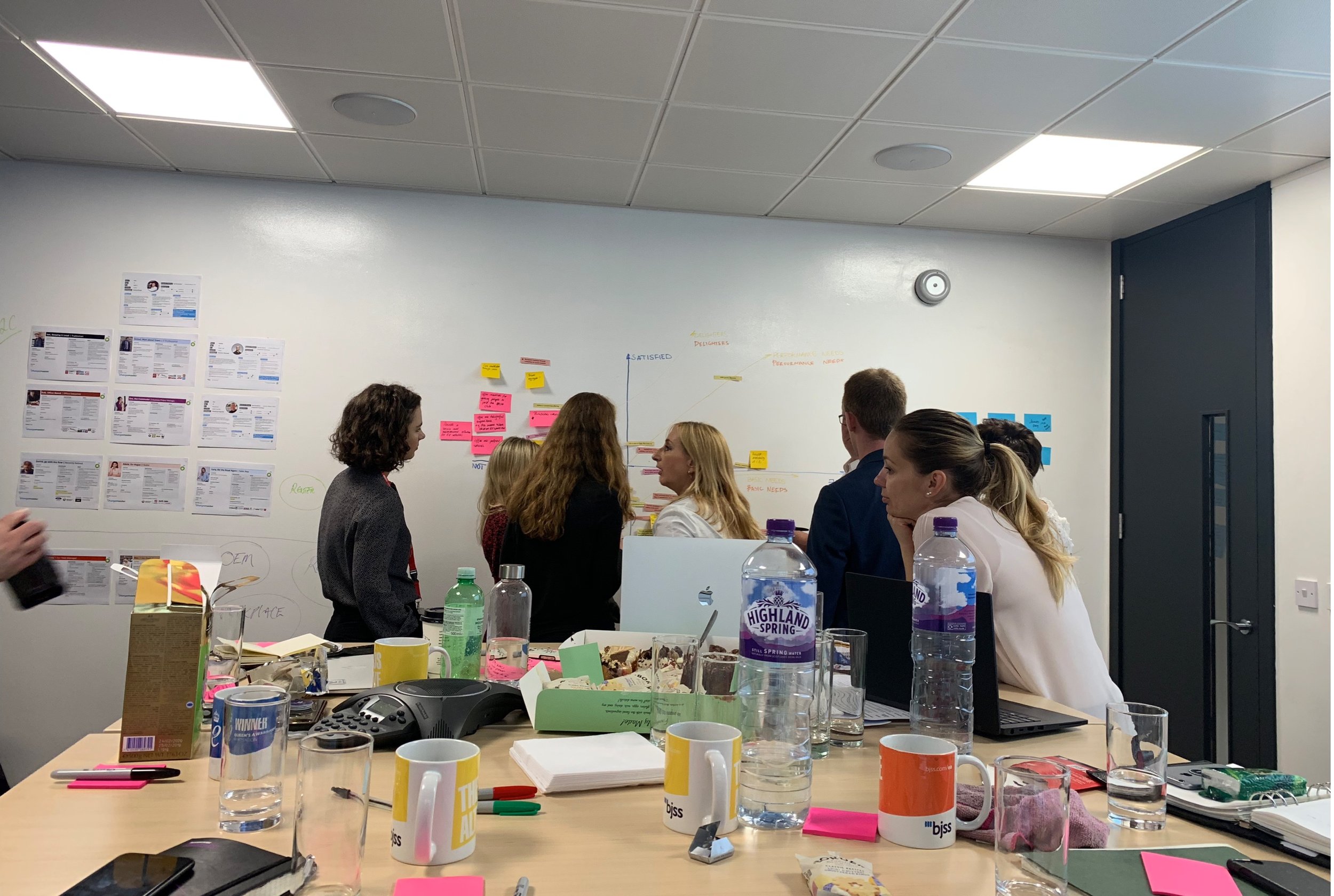
We presented both the personas and the as-is customer journeys for the public network and home charging experiences to the BP Chargemaster team.
During the workshop, we posed these questions to the key stakeholders:
What is the ideal user experience?
What does our research tell us, and is there more needed?
How feasible is this ideal experience?
Do we have the capabilities to deliver it, and if not, what are our gaps?
Reflecting on feedback
After we received feedback from the BP Chargemaster team about the existing journeys, we moved on and asked them to define their aspirational ideal experience. It was an exercise in bringing the stakeholders out of their comfort zone, to readjust the focus onto their customers, on a granular level.
Presenting as-is customer journeys
After gaining an understanding of the different EV drivers, we constructed three journey maps for the different offerings and products.
Solution & Learnings
Future-state service blueprints
We held a second workshop and presented back to the key stakeholders what we understood as their aspirational, ideal future state. Then we went through the process of adjusting and editing the future service blueprints.
18-month digital roadmap
Using all of this feedback, the team and I prioritized what was needed to be done immediately, what were mid-term goals, and what were long term goals for BP Chargemaster. These were laid out on their 18-month digital roadmap.
Women in IT - London
Our team (which happened to be all women) was selected as a finalist in the IT Team of the Year category! It was an honor to have our hard work recognized.
Follow-Up:
Home Charger app
Role
UX / UI Designer
Researcher
Services
End-to-end service blueprint and user journeys
Customer personas and recommendations
Team
2 developers, 2 business analysts, 1 tester, and 2 designers
The Ask
Part of BP Chargemaster’s digital transformation roadmap included developing an app that controls their at-home charger. Alongside one other designer, we designed and built an app to enable users to manage and schedule their electric vehicle’s charging in the home while working within the existing limitations and restrictions imposed by the charging unit’s hardware. We shared blended roles of user researchers and product designers, working to align Design Thinking with Agile/Lean methodologies. We conducted several user interviews, focused on understanding habits and existing routines for EV owners when charging at home. This project took place over only 36 business days in total.
Research
We found that charging habits varied across user preferences; some preferred to set their car to charge during specific hours to save them money (determined by a late-night energy tariff), while others preferred their car to be fully charged and ready to drive in the morning. It became clear that the app needed to provide two different approaches to scheduling charging sessions. We collated and mapped our findings into current and ideal user journeys, and used them to inform the design of our initial wireframes
Architecture and wireframing
Before we moved into wireframing low fidelity, skeleton-style screens, we mapped out all of the different states that the app could possibly feedback to the user. Between the car being plugged in or not plugged in, we wrote out the corresponding “Charging Status” which would then have a specific graphic and color to aid in quick recognition.
Prototyping and testing
We tested the initial prototype with home chargers in an attempt to ‘prove or disprove’ the two different scheduling styles. Users were introduced to a basic ‘charge me til’ version – for those simply wanting a full charge in the morning – and an ‘advanced’ version – for those with stricter charging requirements.
This is a short clip of a user testing the prototype. In this specific task, she was requested to set the car to charge fully by 8am the next day.
After testing with several different user groups, our approach proved to be well understood, and we continued with the direction of this concept. However, we did find that there was a general misunderstanding around the naming conventions used, such as ‘charging blocks’ and ‘‘charging schedules’. So we took this feedback on board and simplified the messaging, while also working closely with the in-house content design and marketing teams to streamline the experience and keep the tone of voice on brand.
UI / Look & Feel
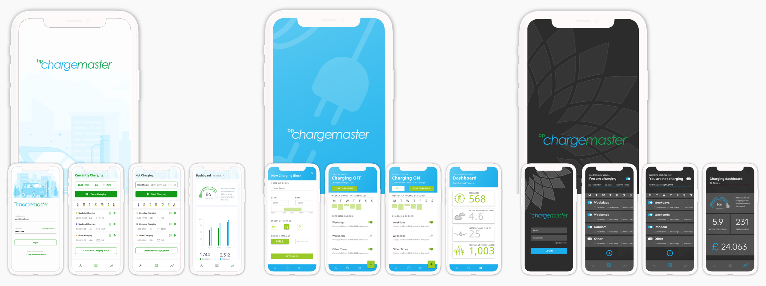
As we refined the journeys and the experience through testing, we began to increase the fidelity of our prototypes; moving from concept to more refined designs. We explored a few directions for the look and feel of the app…
Launch & Feeback
Here is Dylan and I at the Electric Vehicle Centre in Milton Keynes, UK. We tested the app with users there and the HomeCharge hardware that they provided.


